Explore the graphical differences between Yu-Gi-Oh! old and new. While modern evolutions offer enlarged artwork, bright colors and new fonts, older cards convey a unique nostalgic aura. Discover the enchantment of the classics of the past and the graphic evolution that makes each generation of cards unique and unforgettable.
Over the years, the graphic design of the cards has undergone notable changes, introducing new artwork sizes, bright colors and modern lettering fonts. In this article, we'll explore the graphical differences between the beloved Yu-Gi-Oh! old and modern evolutions, while we will celebrate the nostalgic beauty of the first editions from which the Korean sets are still reprinted.
-
The nostalgic aura of old cards: Yu-Gi-Oh! old ones bring with them an unmistakable nostalgic aura, which recalls memories of the first days of gaming and the thrill of discovering new skills and strategies. The simple and modest graphic design of the first editions creates a special bond with long-time fans, evoking a feeling of warm familiarity and love for the classics of the past.
-
The Essence of Enlarged Artwork: The Yu-Gi-Oh! older ones often featured smaller artwork, which focused on the essentials of the illustration. This design choice allowed for greater emphasis on the distinctive aspects of the character or monster represented. While newer cards have expanded artwork, older cards convey a sense of mystery and discovery, where every detail had magical meaning to explore.
-
The soft beauty of colors of yesteryear: Yu-Gi-Oh! cards old, with their softer colors, have a subtle and delicate charm. The soft, nuanced tones transport players to a time when art was created through traditional means, enhancing the beauty of simplicity. These more sober colors capture attention and invite careful and thoughtful observation, allowing fans to discover new details with every glance.
-
The distinctive feature of the old fonts: The old fonts used for the lettering of the Yu-Gi-Oh! they exude a sense of authenticity and time gone by. The more classic characters with thick lines recall the aesthetics of the early times, when each card had a unique and unrepeatable charm. These timeless fonts revive memories of gaming challenges and underline the sentimental value of old cards.
Conclusions: The Yu-Gi-Oh! old ones remain a precious treasure for fans who grew up with the game. The nostalgic aura of the first editions, the artwork that reveals only part of the mystery, the softer colors and the distinctive fonts contribute to creating a unique emotional experience. Although modern graphic evolutions have brought larger artwork sizes, bright colors and new fonts, it is the enchantment of old cards that reminds us of unforgettable moments spent dueling. We celebrate the beauty of the past, while appreciating the graphical evolution that makes each generation of Yu-Gi-Oh! unique and unforgettable.
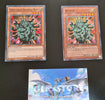
Below is a series of photographs to better visualize these differences:


And which one do you prefer? We are very curious to know what you think.
Comments
-
We stumbled over here coming from a different website and thought I might check things out. I like what I see so i am just following you. Look forward to finding out about your web page yet again.